Accessibility: Let's talk color
Following on my post about my approach to accessibility, I’ve written about the foundations of accessibility, keyboard navigation, and today we’re talking color. As it turns out, color is a more complex topic than it might seem. We’ll start with a quick run-through of some thing designers and developers should be looking for as they create their sites.
First up is contrast. This is important for two reasons. One, many people have a hard time seeing contrast, if they have low vision or certain types of color blindness. Two, their screens may not show contrast as well as we’d like. This isn’t something we often think about because those of us in the industry tend to sit at really nice machines. We have retina displays and big shiny secondary monitors. This is all great for designing with plenty of screen real estate, but it also means we are looking at things on much better monitors and screens than many of our users.
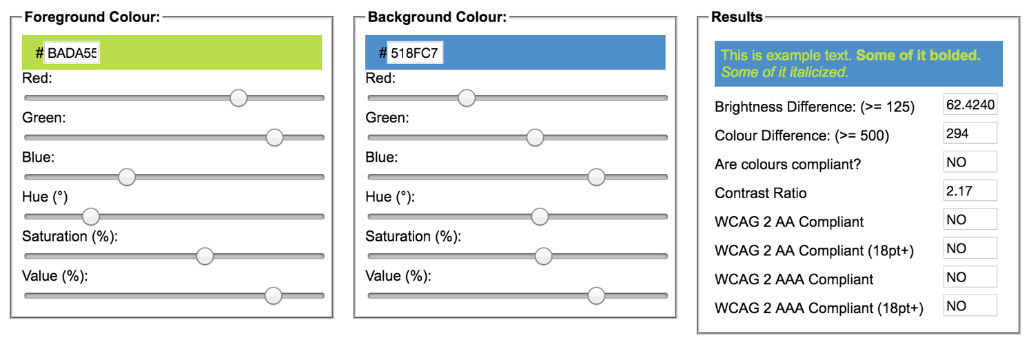
Want to know straight off if you may have contrast issues? I recommend doing an audit in the Chrome developer tools. It provides warnings for contrast, so you can have an idea of where to begin. Then take your colors into Jonathan Snook’s Colour Contrast Checker. Plug in your colors and use the sliders to play around to find what will work in your design and is accessible. Plus, this checker will tell you when you pass and have a good contrast going on.
One of my secrets for making sure that I check contrast is by having a cheap second monitor around. It keeps me honest. Just as we have devices for testing our sites, why not test on something that may not show colors as clearly? If I find myself dragging a design over to my laptop monitor in order see things better, the contrast needs to be punched up.
Next, let’s talk color blindness. There are three different types of color blindness; deuteranopia, red color blindness, protanopia, a red-green color blindness, and tritanopia, blue-yellow color blindness. The latter are much more rare than the first, but you should check your designs for all three.
There’s a great tool that I recommend using to check your implementations called Color Oracle. It changes your screen to show you what it looks like with various types of color blindness. When looking at your design as if you have one of the types of color blindness, you want to make sure you can still see the relevant information and use the site. If not, you may want to change some of your colors. In addition to Color Oracle, check out Spectrum and for Data Visualizations and mapping, Color Brewer is awesome.

Here are some other things to think about: Are you selling things that are different colors? Use words, and not just color swatches, to indicate the available choices. And it’s best to make sure the descriptions are easy to understand. Think about using words that help a user with color blindness identify the color of the product so they know what they are buying.
Another thing to consider is errors. If you use color alone to signal an error, such as changing the input border color for a form error, people who don’t see that color could miss the error altogether. Best to add an icon or some words to indicate the problem so that everyone can clearly see and understand it.
These are just a few things to think about when working with color, from design to implementation. And just like my earlier posts, thinking through these things helps you reach more people, and reaching more people is the goal, right?
This article originally appeared on the Bocoup blog and was edited by Brian Brennan.